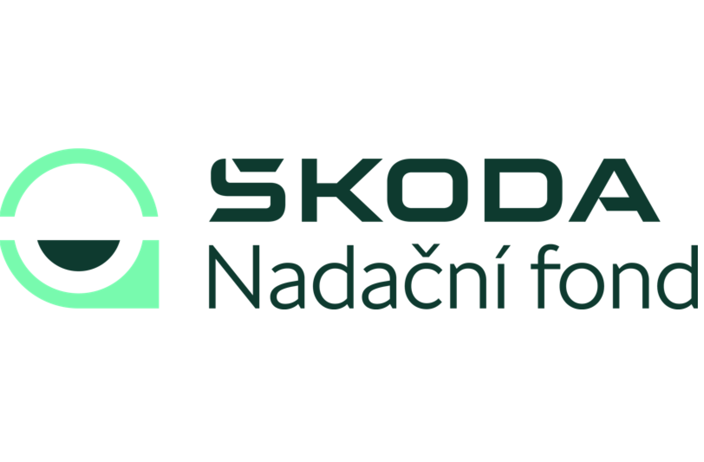
It's happening! 💚
At the end of the year, we celebrated our 5th anniversary. During that time, together with our partners, we have managed to implement more than 600 projects 👀 🤝 For our anniversary, we have given ourselves a new logo that will give the communication drive and move it a little further. 👏
Together with graphic designer Kateřina Roznerová we prepared a new logo where are incorporated our key values – partnership, understanding, connecting local communities, but also our local insight into the regions and enthusiasm for activities, projects and cooperation in general. 😊
The font and colours are in the new visual identity of our parent company Škoda 💚. What's in it?
📍 The LOCATION PIN is our direct connection to the regions where we operate. Do you see what happens when a pin tilts a little to the right and gets a stable base?
💬 TEXT BUBBLE! It emphasizes the importance of communication and emphasizes that dialogue and cooperation are at our core.
🌉 BRIDGE reflects our daily connection with partners, connecting and supporting local communities. In addition to these metaphorical bridges, it also points to the real ones that we initiate to connect the divided banks.
🙂 SMILE expresses philanthropy, our enthusiasm and positive attitude. Or do you see it as a pool referring to our grant of Krakonoš's gardens?
You can also watch the story of our logo as a video
You can find our new logo together with the brand manual on our website: https://www.nfsa.cz/en/downloads